the Sketchbook Project | Grids + b/w pages
This is update number three about my participation in/progress of The Sketchbook Project. I’d love to hear your thoughts on it below. Thanks!

A black and white page with this quoted cat (repeating Miau! in Swedish which is spelled Mjau!) on a carpet of lines. The second page features hands with “life lines”; the grid of wrinkles we all have on the inside of our hands. Kind of playing with both real lines and symbolic ideas of lines here.
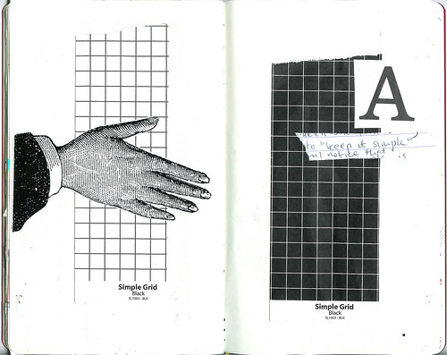
A handshake, the letter “A” and a b/w reversible scrapbook paper actually called “simple grid”!
Before I started filling my sketchbook my blog friend Marcia wrote to me about hers;
I am filling mine more quickly than I thought I would. I am thinking I should have started working in the middle of the book, because the front part has gotten “fat” and I don’t know how it’s going to hold up. I saw on twitter some people are re-binding their books with new paper.
I’m keeping the original rather thin pages, but remembering this email I’ve been working from the middle and I like filling it in this way. It is not a journal so the chronology that I usually am very fond of doesn’t matter. Because I’m keeping my collages rather simple (read small and thin) my sketchbook is not very thick yet. It’s a Moleskine notebooks so it should hold up fine I hope.
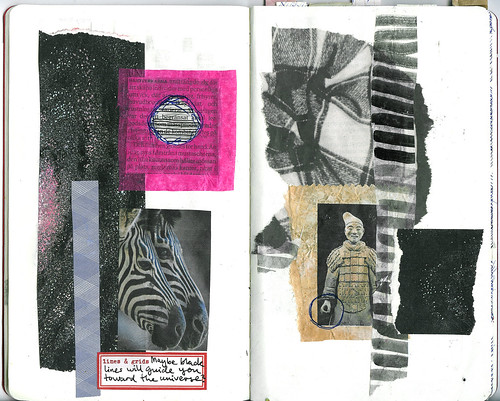
Zebra inspired collage in mostly b/w.
I have finally bought a 1.5″ square punch so now I’m punching out squares and arranging them on the page. I could do that all day, it’s so fun. I am not drawn to punches that look like animals or flowers, but the simple ones I find very useful. I often use my circle punch and this new one will be well used too, I’m sure.
Read more about my cut and paste notebook of grids and lines here: The Sketchbook Project.
Discover more from iHannas Blog
Subscribe to get the latest posts sent to your email.


you have put so much thought into your sketchbook. i am very impressed and it makes me want to “step up” the creativity on my own. thanks for sharing.
I like your pages, the symbolism of the lines and how you have used that in the spreads. Thanks for sharing
Lee:)
Jag tycker mest om det andra uppslaget, det ?r s? avskalat men ?nd? inneh?llsrikt. Lite “less is more”.
Do you work on scrap books everyday…that would explain why you are so talented!
This is amazing, Hanna. I am forever stunned by your vast creativity. The first image is really striking. Wonderful, wonderful!!
LOVE these pages Hanna, they’re really something different!
Inspired as always by your art journaling projects! I am intrigued by this method of picking a theme (lines,grids,etc.) and filling a book with it, just like the colors ones you were working in. I absolutely want to try this!
I love punches too and agree that the simpler ones hold so much more possibility than the fancy shaped ones! (Also, I can’t afford all the pretty ones I want!)
Very interesting to see you use black and white with only a litte bit of colour. I like it a lot!
You go girl! My book is still sitting on my table. UNTOUCHED. Yikes! Maybe I’ll fly to Sweden and steal yours, leaving my blank one in it’s place…??? Happy creations from your friend in germany, tj
Hanna, I sure wish I could see yours in person. i don’t know if I’ll make it to SF. My sketchbook is not going to be any fatter than it is now, which is about an inch and a half thick. I’ve already bulked it up with surfaces, such as the punched squares you mention (although I cut them by hand), and tissue texture, but after that it has been only penwork. It’s holding up fine so far.
I love your interpretation of the theme. So graphic and expressionist. Great work!