365 Collages | Week 11 – Typography Edition
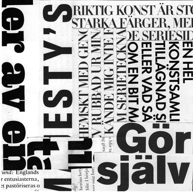
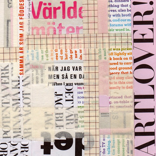
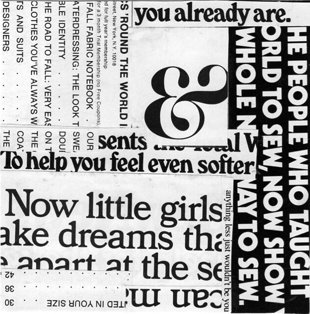
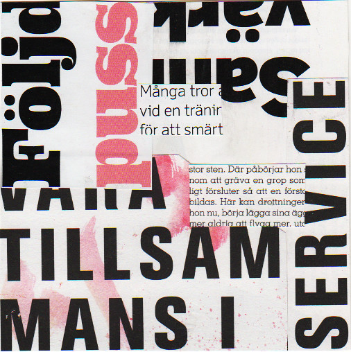
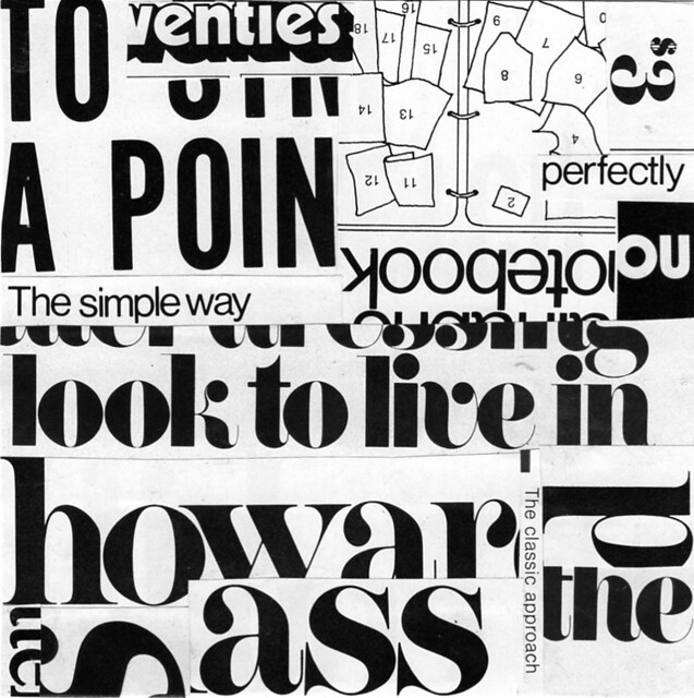
Typography (from the Greek words τύπος (typos) = form and γραφή (graphe) = writing) is the art and technique of arranging type in order to make language visible. Typography Collage might be the art of arranging words so that the aren’t that easy to decipher…
At least that’s what I find interesting about this type of collage. Using specific words together with nonsense letters cut out of their context. In the end – what does it really mean? To me it’s aesthetically both pleasing, interesting and fun!
What do you think?
Week 11 is the second post of collages this week, but after major computer problems (now fixed) I am catching up on scanning for project 365 Collages. Hope you don’t mind… Next week it’s already week 13 and then I’ll be on track posting collages from this week. Yay!
Playing with typography like this is one of the exercises in Plowman’s book. I love typography – and now I know I love to cut it up too. These reminds me of a crusade called text messaging…
I thought I could make seven black and white collages – but after just two I had to mix it up. I simply couldn’t create seven small collages in a row without some colour… I guess that’s just the way I am.
The English typography is from a old Vouge mag that Stephanie once sent me. The typography in it is perfect. I knew I was saving it for something…
Let me know if you try b/w – and which of these you like the best. Thank you!
Previously: week 10.
Discover more from iHannas Blog
Subscribe to get the latest posts sent to your email.


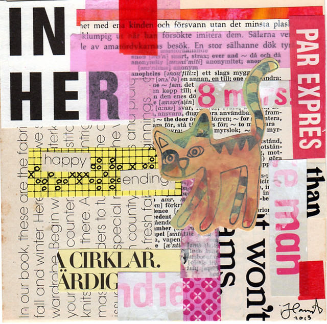

Finns s� m�nga fina typsnitt, en konst i sig! Och tillsammans s� blir det �nnu finare.
Oh this is such a great idea!! I have so many magazines with mainly words (I have cut out and used all the good images already haha). I can’t bring myself to throw them away, and now I don’t have to! I think my favourite one is the last one, I love the mix of pink+red. As always, thank you for the inspiration :) xx
I guess I like color too because Typography Travels is my favorite!
Hi Hanna. I loved your typographical collages and i am truly inspired by what you have done. I made a trial as well with Tammy’s prompts.
I’m going to try typography AND black and white because you are always inspiring me to push the envelope creatively (but I still love color, especially pink, and have to admit that “Typography Travels” is my favorite!)
Love the typography edition!! I’ve been working in black and white this week too but had to include a bit of colour here and there. We’re just not people who can live without colour… Fabulous job on all of them!
I love your typography collages, Hanna! I think my favourite is “It’s a Typo”, which blends typography with bits of graph paper, since graph paper is also one of my favourite things to use in collages and journal pages. I like how the typography collages blend words together and make new words and phrases appear.