365 Collages | Week 40 | The White Edition
This week of collages turned out all white. It just happened like that. I made one collage and was inspired by that one to build others that were similar. The same feeling, but from different perspectives.
Imagine standing in a sand storm or in thick fog. You can’t see the details but you almost recognize where you are… I hope you like them, let me know in the comments below! Thanks.
Thank you for your visit!
This is a post in my series 365 Collages in 2013 | Plan Your Own 365 Project | About my Creative Process | Previously: Week 39 | Next: Week 41 (the invisible series)


Love-love-love-love-love it!
I just love your work. It is just beautiful.
Thank you for sharing with us.
Thank you, I appreciate that a lot!
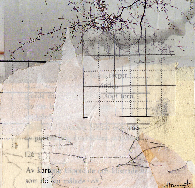
I love the black and white with the touches of craft paper! It is one of my favorite palettes. The tree branches really drew me in.
I love all of them, they are beautiful!
Very, very beautiful! Thanks so much for sharing. I love your blog!
Take care,
Holly
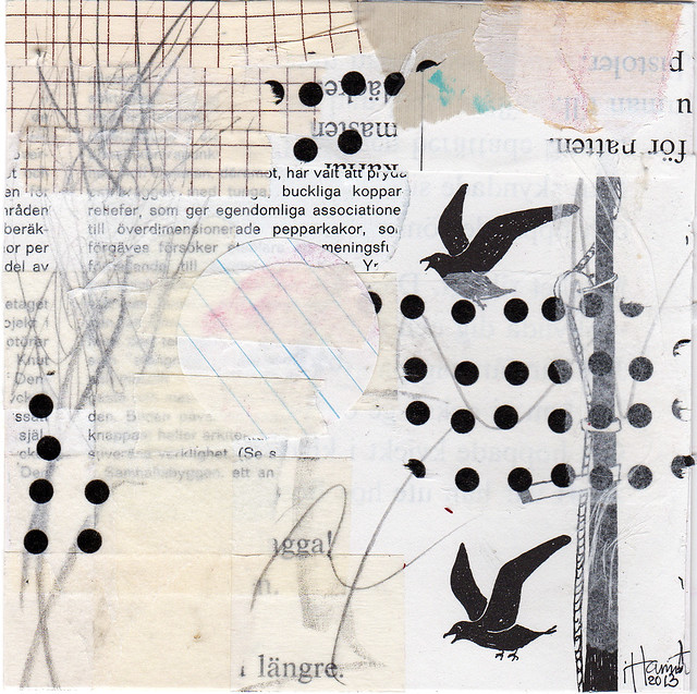
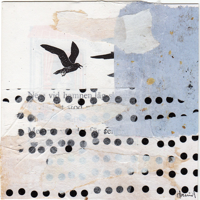
I like all of them, but I LOVE the first one, “In vain”!
I do love them – I really do. I think it’s all the gritty texture. Simple at a glance but so much more as you really look at them.
I am a fan of white and black and white and beige, so I love these. It is like I am looking through a foggy window and when I wipe it off, I see something else that was hidden before. Stunning. Thank you for sharing and inspiring.
I especially love this group!
Love all of them, Hanna!
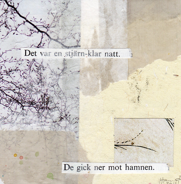
Although I tend to love your brightly colored artwork the most, I really liked this week’s “Stellar Sky.” The branches are gorgeous and the overall piece makes me smile and feel happy and content inside. Thanks for continuing to share your beautiful artwork with us!
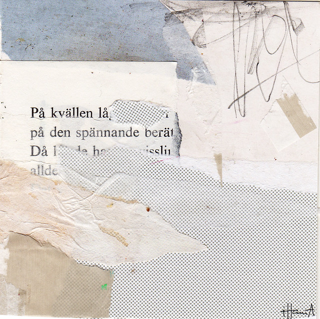
These are all so very beautiful! I am particularly fond of monochromatic collages & you have done a fabulous job with white! I really love “Sweet Harbor Home” & “Soft & Sacral”.
These are amazing Hanna! Windblown is my fave though. Love those branches!!
I love the very first one you shared so much.
my favourite is the last one :)
ooohhh really love this color scheme, they all look GREAT!! If I had to pick a favorite it would be the 1st or 3rd one but love them all!!! I like the tree branches that is what makes me smile.
Thanks for the inspiration !
I m always surprised about how do you find the titles for your great collages. They always match the look so very well … and I know from my own artwork that it is kinda hard to name the piece in a way everybody gets an idea and an access to my artistic intension and the message. … even if it’s made for looking good only and has no message. :D Sooo well done!
I love most “Sweet Harbor Home”. I really can smell the sea breeze and hear the cries of seagulls.
Love “Soft and Sacral”, “Stellar Sky” and “In Vain” the most this week but they are all beautiful. I love the use of circles in “In Vain” – the small black circles and then the way the lines on the notebook paper circle draw your eye around the piece. The texture on “Soft and Sacral” is amazing, you could look at it for hours!
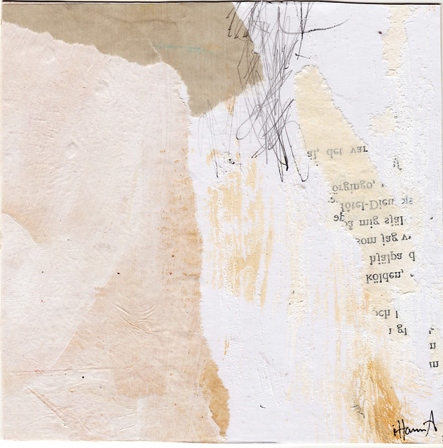
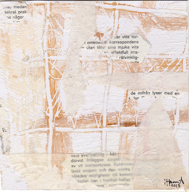
These are beautiful, very warm! The textures are amazing, especially in “The Vanishing Point”.
Love the white ! My favorite is Windblown.
Happy Thursday, Lovely Hanna !
This is quite a departure from your usual color, pinky self :) and I love them. Simple yet so full of depth and interest…..somehow stronger without the distraction of lots of color. My collages are usually pretty colorful too, but these make a strong case for trying a subdued series. Fabulous job!
Hanna I love the white on white but being from a place of long winters like you are (I’m from Minneapolis in Minnesota in USA)
I am gathering up ALL the color I can before everyday feels like one of your white editions :-)
I will attempt a few white on whites once the snow really starts coming down!
Thanks as always for your inspiration,
Best,
Pam
I love this group. Especially “The Vanishing Point”. I can imagine that one on a much larger scale worked with torn pieces of canvas fabric and paint. Stunning!