New WordPress Theme | Time to Evolve
I still write for an audience of one. I read things that stimulate me and inspire me and help me figure out how to live and then I write about them. The fact that there are other people who enjoy it is nice, but it’s just a byproduct.
Maria Popova
When you travel you get to experience life with new eyes. I think that is part of the appeal of going to new places: we actually see them so much clearer than we see our own home town or city. It’s a little bit like we become blind to beauty and the magic of our surroundings when we encounter it every day. When we go away we become kids again. Kids at that (wonderful?) age when they want to ask about everything. Why is this and how come that is to?
Traveling takes us to places we haven’t seen yet, but the reason those places are so magic is because they are new to us. We only have to stay at a hotel for a week to get into maybe not a rut, but habits and behavioral patterns we carry with us. We need the familiar to relax I think. And we need change to shake things up.
Kick your own butt
When we feel stuck or like we are creatively blocked, one of the advises we are given is to “change things up”. To give yourself a kick in the butt (a kick in the butt is slang for “A forceful gesture or message of some kind (usually delivered with good intentions) that acts as motivation to the (previously unmotivated) recipient.”)
A kick in the butt for you could be to go create in a new place, buy a new tool, take a class or workshop or simply turn our desk around and re-arrange the room. Or if possible; apply for a new job, go travel, walk along a road you’ve never walked before or do something that you’re afraid of. That will probably shake things up for you, in one way or other. Change is scary but sometimes it is a good thing. We do need change because if we always do the same thing in the same way we’ll never learn anything new. You might never challenge yourself. You’ll never know what’s on the other side of the fence…
For me, this time, it’s been this blog that has become stale and boring. I’ve kept it for over 15 years, and though I’m always tweaking things I noticed my posting rate getting lower and lower. My interest for “doing the work” declining. But instead of quitting entirely I decided to change things around a bit, and see if that would help.
I’m kicking my own butt out of the couch and into my desk chair. It’s time to let this blog evolve again, and change things up a bit.
What iHanna’s Blog looked like until just now:
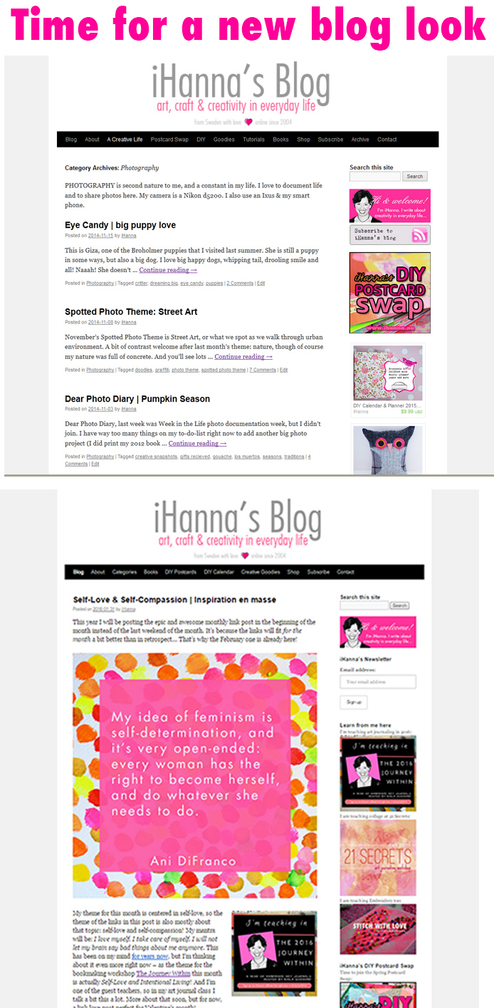
My previous WordPress Theme was the standard 2010 theme provided with the update of that year. So my blog hasn’t changed look for nine years? OMG, that is just so sad, Hanna. What happened to you?
Well, one of the problems has been that with the new times comes new techniques – and I haven’t been keeping up with it all. When I started to blog I read a lot about coding, writing blog posts and updating your older content and such. Now, not so much. And I was also fearful that this wee blog of mine couldn’t keep up with the trends… One simple example is that I started writing this blog, but after a while I decided to host all my photos on Flickr and just link them in here with HTML. That means that I’m dependent on having a Flickr PRO account, and that most new themes that creates thumbnails for you in new ways wouldn’t work.
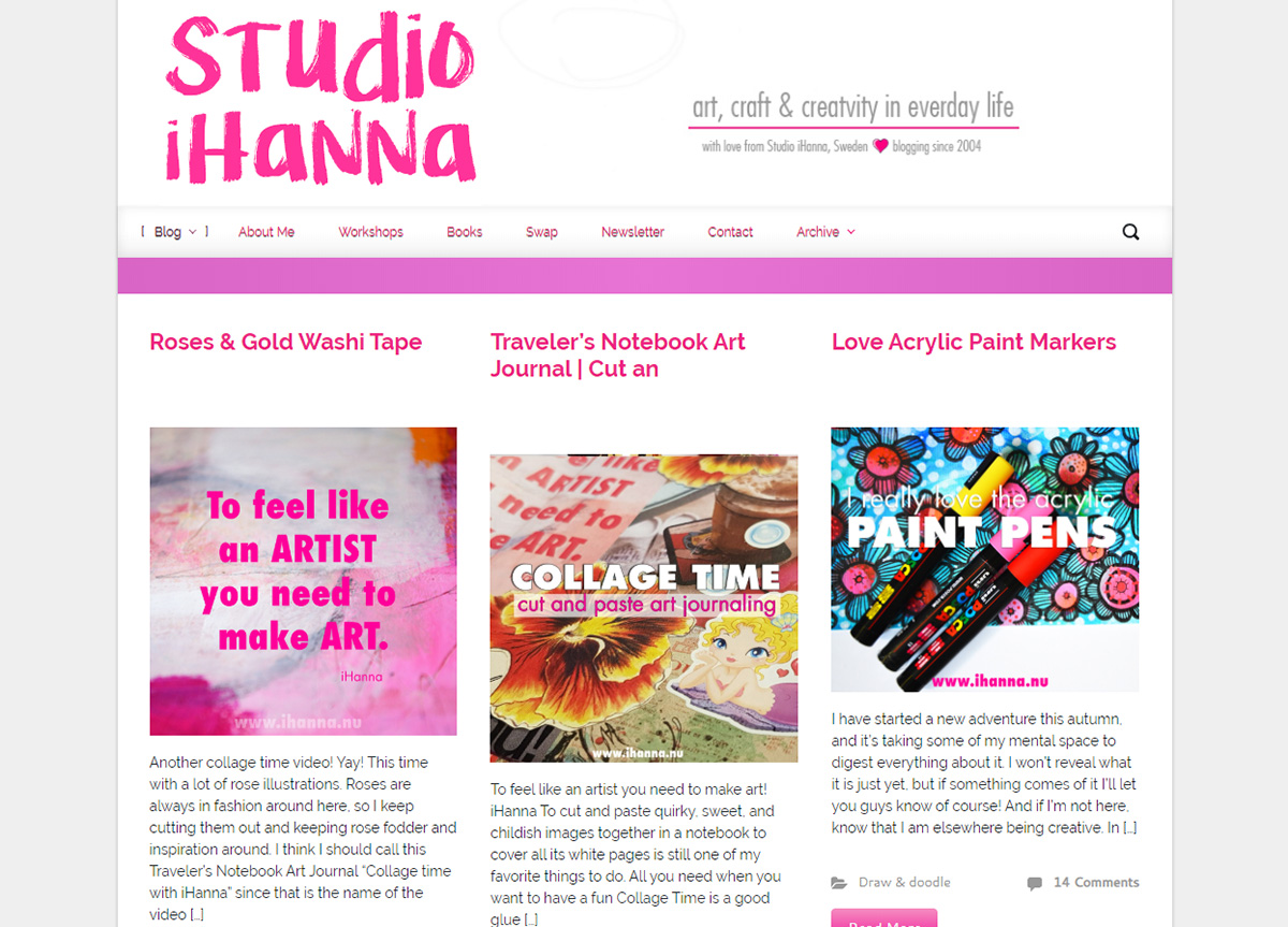
High time to Evolve
I struggled with the WordPress Theme problem for years, until I found a theme (it’s called Evolve!) that I could use! It takes my Flickr-hosted images and uses them in overview layouts (like front page/index and all of the category pages for example) with thumbnails. It’s so exciting! I loved the preview of that theme so very much, but always procrastinated on when to do the big switch. I knew I would need to go through all pages and do a lot of changes here and there when I incorporated a new theme, so I postponed it for years. Until now, last weekend.
I just went up and did the switch! And if I may say so myself, it looks amazing. I love everything about this new blog look!
It’s responsive, which means that the text and images adapts when you enlarge or shrinks your browser window – it responses and looks good no matter how you change it up! It even looks 100 percent awesome on mobile phones now, feel free to go take a look for yourself. I am in love with how everything looks on my blog right now. I don’t have a mac to test it on, so if you see any problems there let me know with a screen grab and I’ll see what I can do.
It also has what I think is called a “sticky header menu”, that stays with you on all pages like this:
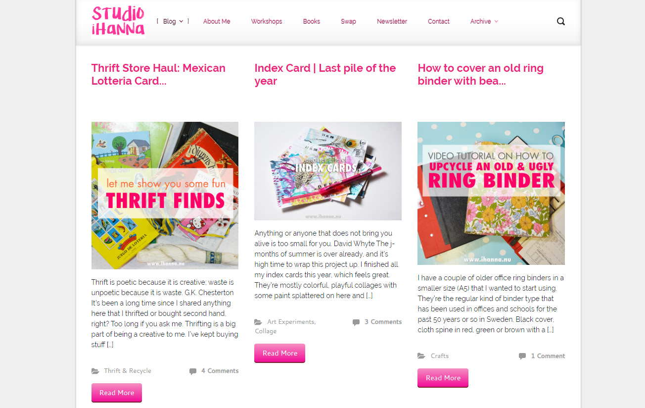
The navigation takes up a lot less space in this way, but it’s always there to help you get back to the main page, or even find the extensive archive or one of the categories of the blog. I love how the logo shrinks up and becomes small when you scroll down on the main page. Yes, things like that delight me.
For example, visit the category of Tutorials to see how it looks now with three columns of tutorials with the first image of the post listed with the first few paragraphs. I think it looks clean, inviting and awesome. And while you’re on that page, keep scrolling downwards, because as you do, new (older) content will present itself as a never-ending (but it does end when you reach my first tutorial post of course) menu of choices! It’s fun, right?
I’m sure I’ll keep tweaking things and adding stuff later on, but for now I couldn’t be happier with my blog’s changed look. Of course I’d love to know what you think about the new look and functionality? Click on over if you’re reading this in a blog reader or via e-mail to take a look. Then: Leave me a comment below and tell me.
Discover more from iHannas Blog
Subscribe to get the latest posts sent to your email.



Congrats on making yourself tackle that project you�ve been wanting to! I read your blog mostly from my phone nowadays, and the new layout looks great! Thank you for continuing to provide us with a pretty, fun, inspiring corner of the internet!
Hi Hanna! The update looks and works great. It works great on my Mac, no problems. Enjoy all your inspiration and I agree that sometimes you just need to shake things up to get motivated. For me that usually means it’s time to rearrange the furniture or go through stored supplies. Congratulations on the blog update!
Yay Hanna! Happy you found a design that worked for your photo process! I know it was a heck of a lot of work to make the upgrade and it turned out just great!!!
ha ha, I love that you defined “kick in the butt”.
Your new theme looks great. There’s so much on the back-end of blogging, outside of simply writing. And things change so rapidly that a cutting-edge blog from five years ago looks outdated today, it seems. That’s a little intimidating.
But I think that the essence of a blog is its content, and you’ve always delivered here, Hanna!
Thanks for your happy posts, I enjoy reading about what you’re up to.